Student GIS Projects

I’ve been teaching the Introduction to Geographic Information Systems (GIS) class in the Earth, Environmental, and Sustainability Sciences (EESS) Department for about 11 years. Suresh Muthukrishnan (department chair) also teaches the course. I’ve learned a ton from him. Here are some things I really enjoy about teaching the course:

House flipping hotspots near the Cincinnati Streetcar route. An example map from student Charlotte Moore.
  • Interdisciplinary Nature – Students from across campus take the course. Of course, there are lots of EESS majors. However, even those projects run the gamut. Projects like geologic mapping, landslide risk, sustainable farming, and even mapping data from GPS collars on mountain lions. But students of history, economics, sociology, computer science, business, and music also come up with some great projects.
  • The Opportunity to Learn – Every semester, students will come up with novel questions and methods. I think my typical response is, “I haven’t done that before, but I know it’s possible. Let’s figure it out together.” So I learn something new about GIS, as well as all the topics above, each time I teach.
  • Community Connections – Many of the projects involve community partners–folks like the Greer Police Department, Upstate Warrior Solution (which serves veterans), Greenlink (our public transportation department), local land conservation non-profits, the forestry department, and community associations. Our first deep partnership involved mapping streetlights, which I’ll talk about in another post.
  • Working with Our Post-Baccalaureate Fellows (postbacs) – I’m grateful to get to work with two recent Furman graduates who are on our team. Catherine Lippert (Sustainability Science) and Sam Hayes (History and Politics and International Affairs) are an integral part of teaching the course. They have serious GIS chops and roll up their sleeves to help the students with projects, every step of the way.
  • Project-Based Learning – The course involves a semester-long project. It’s a real challenge to teach GIS principles, create meaningful labs, AND support students as they use these concepts and tools to apply what they’ve learned to address a real-world problem. Every semester I think, “We took on too much. This isn’t going to happen.” But it always comes together. Here’s the syllabus for the class.
An historic, georeferenced map of Charleston Harbor (1711). From a student project by Kylie Gambrill.

Here are some examples from a recent class. I don’t want to make it seem like I’m taking credit for these. The students did the work. Catherine, Sam, and I were teammates. However, the examples are illustrative of the range of projects that are possible. The projects are easier to share, now that we have switched the delivery format from poster presentations to StoryMaps.

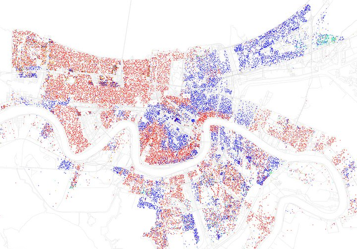
Charlotte Moore: Transit-Motivated Gentrification: An analysis of gentrification in Over-the-Rhine, especially as a result of the Cincinnati Streetcar.

Caroline Vickery: Contextualizing Upstate Farms: A preliminary examination of land use and nutrient loading for small farms in the Upstate of South Carolina.

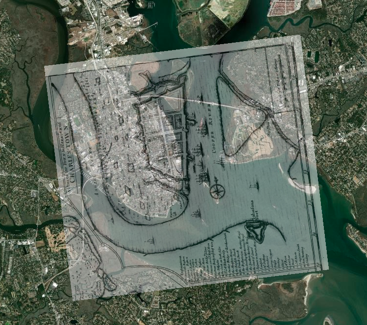
Kylie Gambrill: Understanding Change: The Charleston Harbor — Our perceptions of the environment around us depend upon the cultural context we find ourselves in.

Bennett Dean: Affordable housing and public transportation in Greenville.

 Chloe Sandifer-Stech: Recommendations for green space around Enoree Career Center: A study of the influence of tree density on carbon storage.

Jake Gerardi: Land Sparing/Sharing Impacts on Birds: Assessing habitat quality of southern bird species using ecological principles in Greenville watersheds.

Madison Eichhorn: Affordable Housing & Good Jobs – An evaluation of proximity, density, and availability of affordable housing and employment.

Austyn Feigenbaum: Boating Safety Zones and Florida Manatees: An investigation on the relationship between manatee death rates and boating safety zones along the coast of Florida.

I hope you’ve enjoyed seeing the range of student projects and learning more. It’s a pleasure to see all the hard work result in such great studies and stories.

Lessons from 1918

After reading this article about how different cities handled the 1918-19 flu pandemic, I decided to get the data graph it. You can see the impact, and the result of St. Louis and San Francisco letting their guard down too early—despite stronger responses in the early phases.  It appears SF likely overestimated the effectiveness of masks in preventing the spread of this particular virus.

I realize the that virus and Covid-19 are different, but perhaps there’s still a lesson to be learned from history.

Philadelphia (1918) – It’s just like the regular flu. Just keep your feet dry and your bowels open. We’re not canceling the parade.

St. Louis (1918) – This is serious. Avoid crowds. Treat people in their homes if possible. Act early.

San Francisco (1918) – This is serious. Implement social distancing. Wear masks.  

Data source below:

Collins, S. D., Frost, W. H., Gover, M., & Sydenstricker, E. (1930). Mortality from influenza and pneumonia in 50 large cities of the United States, 1910-1929. Ann Arbor, Michigan: Michigan Publishing, University Library, University of Michigan.

GIS and Social Justice

At a recent faculty gathering on community engagement, I was asked to provide some examples of how Geographic Information Systems (GIS) is being used to support different social justice initiatives. While there are many examples, I didn’t have much time to share, so I highlighted just a few compelling examples, which are shown below.

If you’re interested in learning more about GIS and social justice, these resources are a great place to start, although I find the inequity that the maps reveal to be very disheartening.

New Orleans
New Orleans, LA from Business Insider – http://www.businessinsider.com/most-segregated-cities-census-maps-2013-4?op=1

  1. The Revolution Will Be Mapped – This article gives an overview and describes some recent cases in which maps played a key role in highlighting discriminatory practices in the provision of public services.
  2. Redlining Maps –If you click on an area, especially those in red, you can see the disturbing (stunning, actually) area descriptions–circa 1930.
  3. Million Dollar Blocks – NPR highlighted the Justice Mapping Center’s work on visually representing incarceration rates and costs. Million dollar blocks are “areas where more than $1 million is being spent annually to incarcerate the residents of a single census block.” The maps are being used to identify areas for establishment of re-entry programs. You can check out data for Greenville County by zip code and census block here. Click on the state, then the county for details.
  4. Maps of Highly Segregated Cities – Each map provides a dissimilarity index. “A score above 60 on the dissimilarity index is considered very high segregation.” The symbology is very powerful. For New Orleans, you can clearly see the high elevation area along the river that geographer Richard Campanella refers to as the “white teapot.”
  5. Underbounding – I happened upon this term while doing a little research for the session. This is a practice by which certain groups (usually poor minorities) are excluded from annexation and associated services.
  6. Dividing Lines: School Districts in the US – This map shows how current educational funding practices limit fair access.
  7. Social Explorer – Our library is currently evaluating a subscription to Social Explorer, which should make it much easier to use the browser to map demographic data going all the way back to the 1790 Census. No desktop software required.

Campus Technology Award

Our project using Google Earth to connect Boston, NY, and Greenville in Lloyd Benson’s Urban History class won an Annual Campus Technology Award. Check it out!

Here’s a little bit more info on the project that I put together for a NITLE conference this spring.

 google_earth_tour.gif

Project FAQs

It’s amazing how quickly things change. Picasa and Flickr now automatically put geocoded images on the map. For Flickr you have to make sure this is set to ‘yes’ in the privacy and permissions section of your profile.

flickr

Here’s an example of an image in Picasa that is automatically placed on the map. I took it with an iPAQ with built-in GPS. I almost walked right through the web when getting out of my car. That would have been interesting! It reminds me of the time I put my kayak on my head to carry it, and a big spider that had set up camp started falling towards my face. I closed my mouth just in time!

spider

Timeline software with AJAX

You’ve probably experienced AJAX through google maps and other websites. It makes for a great web experience, especially for the impatient. Dr. Lloyd Benson provided this timeline link. My colleague, Dr. Diane Boyd, had a great idea to combine timelines and maps, updating the map as the user progressed along a particular timeline. We’ll have to learn AJAX programming to do it, or perhaps it might fit into an First Year Seminar with a historical and technological focus, and the students could drive the construction. It’s definitely something to keep on the radar as we continue to strive to help students incorporate historical perspectives into their learning experiences.